A couple of weeks ago, I've been attending 2011 user experience Sprint, in Berlin. That was interesting and nice and productive and everything, and above all it was my first live encounter with other KDE people, including Nuno.

There's been (notably) quite some discussions about how information and functionality should be presented to users, organized and formulated, in order to be complete but not overwhelming, sexy, gratifying, and elegant.
Now, no matter how well organized resources, features, and information are, a significant fraction of the above can be wasted if every single brick of the UI is not rendered perfectly.
So Nuno (finger above) and I have been focusing on the remaining UI elements for which we are not fully satisfied, pretty much disregarding how these elements are used later on.
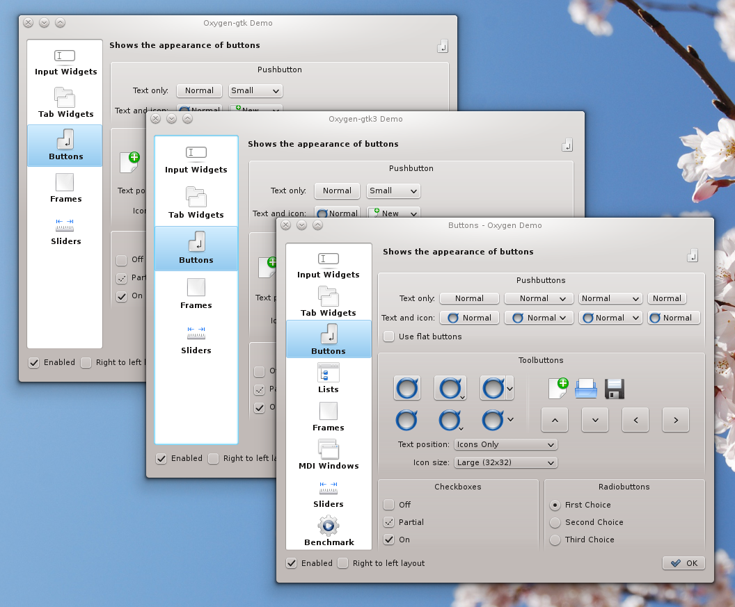
Two screenshots to illustrate the progress we've made during these few days.
First screenshot is Dolphin:
 Things one notices:
- more visible pressed tool buttons at the top
- new slider at the bottom
- and new folder icons (quite unrelated with this post actually), on which Nuno has been working lately (and I'm sure he would blog better than I about it).
- improved holes for the scrollbars, progressbars, and main view (note notably how the main view bottom corners are better rounded)
- improved (well, bug fixed) rendering of the capacity bar at the bottom.
Second screenshot is K3B:
 K3B is using nice title frames all over the place for quite some time now (the icons and text over a blue background on the picture above), but which have not been rendered properly by oxygen so far (notably, there was one or two pixel between the frame shadow and the blue content, that was pretty much wasting all the effort). So we finally took some time to fix it, resulting in the above, which is closer, I think, to what was originally intended.
We've made other changes here and there and we still have some in the pipe before KDE 4.7 is out. Most of them are barely noticeable but we believe it will make oxygen look sharper, more polished and pleasant to the eye, one pixel at a time.